
SAN ANTONIO — As San Antonio Metro Health has provided more data about the coronavirus pandemic in Bexar County, KENS 5 has tracked the county's total number of cases and the corresponding curve.
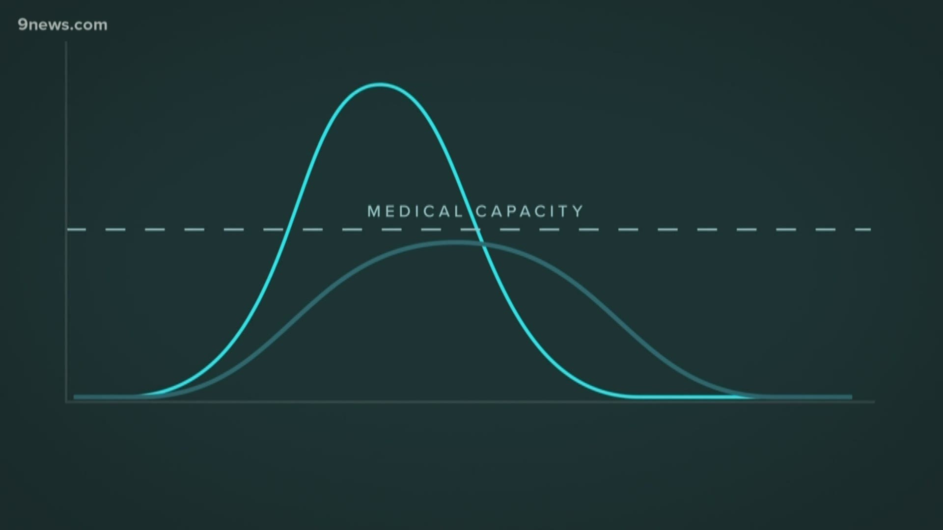
What’s a curve?
According to the CDC, the curve (or epi curve) – often referred to when public officials are discussing “flattening the curve” – is “a visual display of the onset of illness among cases associated with an outbreak” during an epidemic.
This information helps health officials identify a few key indicators: the total distribution of cases over time, cases that stand out from the overall pattern (or outliers), the magnitude of the outbreak, patterns on how the virus is spread, and the period of exposure.
As the number of cases increases, officials will continue to eye the trajectory of the curve – or the steepness of the rise in cases – and amend, or create, public health guidelines to combat the spread.

This also helps epidemiologists to understand the mode of the spread of the disease: point source, continuous common source, or person-to-person (also known as a propagated outbreak.)
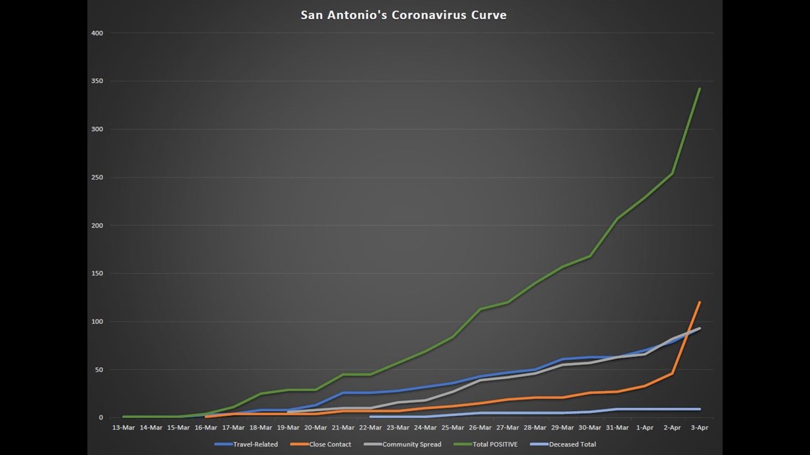
San Antonio’s Curve
Based on Metro Health’s released data – current as of April 3 at 8 p.m. – Bexar County currently has 342 positive cases. That number jumped Friday because of the localized outbreak at the Southeast Nursing and Rehabilitation Center, and it is expected to continue to increase due to ongoing community spread.
So far, the highest single-day increase was an additional 88 positive tests that occurred between Thursday and Friday – the majority at the rehabilitation center and identified as close contact. If you look at our graphic, you’ll see the line becoming steeper on the final day due to the number of cases there.
During Friday morning's news conference about the localized outbreak at the rehabilitation center, officials noted that the number of community spread cases (82) surpassed the number of travel-related (79) for the first time in Bexar County.
You can see that in our graphic where the “Community Spread” line (in grey) intersects with the “Travel-Related” line (in blue) on April 2. Those numbers were amended later Friday evening, marking both at 93 as more test results came in.
Since Metro Health began releasing the breakdown of positive cases, the number of cases of community spread has increased from six on March 19 to the current number of 93.
The number of close-contact transmissions has increased from one on March 16 to the current total of 120. You’ll notice the increase in our graphic following the “Close Contact” line (in orange).
Also included in that data is the number of deaths that has continued to increase from one on March 22 to nine as of March 31 – where the number has remained.
KENS 5 has not included all of the information released by Metro Health, and only focused on the total number of positive cases, and the total number of deceased individuals. If you’d like a more detailed breakdown of the most recent numbers, you can find that by going to the city’s Coronavirus website.
Using the curve to find transmission
A point source outbreak, as outlined by the CDC, is when “persons are exposed over a brief time to the same source, such as a single meal or an event. The number of cases rises rapidly to a peak and falls gradually. The majority of cases occur within one incubation period of the disease.”
In a continuous common source outbreak, “persons are exposed to the same source but exposure is prolonged over a period of days, weeks, or longer. The epi curve rises gradually and might plateau.”
During a propagated outbreak, “there is no common source because the outbreak spreads from person to person. The graph will assume the classic epi curve shape of progressively taller peaks, each being one incubation period apart.”
When analyzing the mode of viral spread, the graphed data rarely perfectly fits the descriptions exactly. For example, during “propagated outbreaks, the shape might show overlapping waves of cases that obscure subsequent peaks, and peaks might diminish more slowly over time. You can, however, get a general sense about the mode of spread of an outbreak from its epi curve.”
The big picture: 'It’s not the peak of the outbreak'
Dr. Dawn Emerick, with San Antonio’s Metro Health Department, expanded on the increase in recent cases at the rehabilitation center, and made a point to clarify to the community that, “It’s not the peak of the outbreak. It’s going to feel like that.”
The peak Dr. Emerick is referring to, as defined by the CDC, is the “time period when the largest number of cases” occurs. The timeline for the peak, and the number of positive cases expected during that peak, is unclear, and relies heavily on the success of the mitigation efforts – the "Stay Home, Work Safe" orders – issued by city, county and local officials. In other words, more cases are expected.
More coverage from KENS5.com: